
Title
Helvetica and the New York City Subway System: The True (Maybe) Story (Mit Press),Used
Sold by Ergodebooks, an authorized reseller.
Returns accepted within 30 days | support@ergodebooks.com
Shipping Information
- Free Standard Shipping — United States only
- Processing Time: 3–5 business days
- Estimated Delivery: 6–10 business days after dispatch
- Double-boxed, fully insured & discreetly packaged
- Tracking number sent via email once dispatched
Returns & Refund
Returns accepted within 30 days of delivery.
Damaged or Defective Item
Free return shipping + replacement or full refund
Wrong Item Received
Free return shipping + replacement or full refund
Change of Mind
Return shipping at customer's expense · 25% restocking fee applies
Payment Option

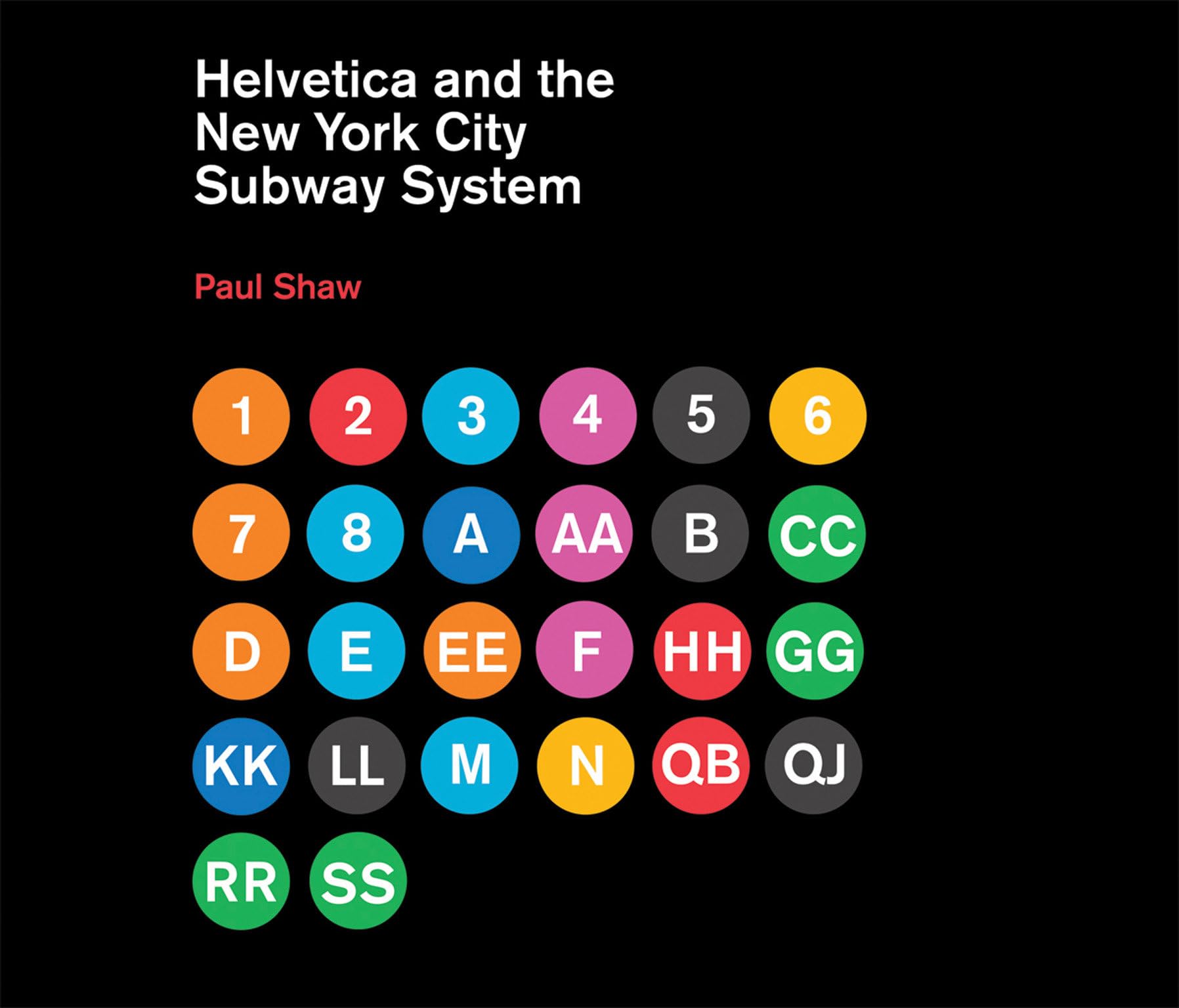
How New York City subways signage evolved from a visual mess to a uniform system with Helvetica triumphant.For years, the signs in the New York City subway system were a bewildering hodgepodge of lettering styles, sizes, shapes, materials, colors, and messages. The original mosaics (dating from as early as 1904), displaying a variety of serif and sans serif letters and decorative elements, were supplemented by signs in terracotta and cut stone. Over the years, enamel signs identifying stations and warning riders not to spit, smoke, or cross the tracks were added to the mix. Efforts to untangle this visual mess began in the mid1960s, when the city transit authority hired the design firm Unimark International to create a clear and consistent sign system. We can see the results today in the whiteonblack signs throughout the subway system, displaying station names, directions, and instructions in crisp Helvetica. This book tells the story of how typographic order triumphed over chaos.The process didn't go smoothly or quickly. At one point New York Times architecture writer Paul Goldberger declared that the signs were so confusing one almost wished that they weren't there at all. Legend has it that Helvetica came in and vanquished the competition. Paul Shaw shows that it didn't happen that waythat, in fact, for various reasons (expense, the limitations of the transit authority sign shop), the typeface overhaul of the 1960s began not with Helvetica but with its forebear, Standard (AKA Akzidenz Grotesk). It wasn't until the 1980s and 1990s that Helvetica became ubiquitous. Shaw describes the slow typographic changeover (supplementing his text with more than 250 imagesphotographs, sketches, type samples, and documents). He places this signage evolution in the context of the history of the New York City subway system, of 1960s transportation signage, of Unimark International, and of Helvetica itself.
⚠️ WARNING (California Proposition 65):
This product may contain chemicals known to the State of California to cause cancer, birth defects, or other reproductive harm.
For more information, please visit www.P65Warnings.ca.gov.