
Title
Show Me The Numbers: Designing Tables And Graphs To Enlighten,New
Sold by Ergodebooks, an authorized reseller.
Returns accepted within 30 days | support@ergodebooks.com
Shipping Information
- Free Standard Shipping — United States only
- Processing Time: 1–3 business days
- Estimated Delivery: 3–5 business days after dispatch
- Double-boxed, fully insured & discreetly packaged
- Tracking number sent via email once dispatched
- Orders over $250 require signature upon delivery. Taxes calculated at checkout.
Returns & Refund
Returns accepted within 30 days of delivery.
Damaged or Defective Item
Free return shipping + replacement or full refund
Wrong Item Received
Free return shipping + replacement or full refund
Change of Mind
Return shipping at customer's expense · 25% restocking fee applies
Payment Option

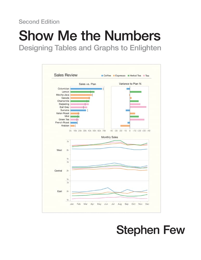
Most Presentations Of Quantitative Information Are Poorly Designedpainfully So, Often To The Point Of Misinformation. This Problem, However, Is Rarely Noticed And Even More Rarely Addressed. We Use Tables And Graphs To Communicate Quantitative Information: The Critical Numbers That Measure The Health, Identify The Opportunities, And Forecast The Future Of Our Organizations. Even The Best Information Is Useless, However, If Its Story Is Poorly Told. This Problem Exists Because Almost No One Has Ever Been Trained To Design Tables And Graphs For Effective And Efficient Communication. Show Me The Numbers: Designing Tables And Graphs To Enlighten Is The Most Accessible, Practical, And Comprehensive Guide To Table And Graph Design Available.The Second Edition Of Show Me The Numbers Improves On The First By Polishing The Content Throughout (Including Updated Figures) And Adding 91 More Pages Of Content, Including: 1) A New Preface; 2) A New Chapter Entitled 'Silly Graphs That Are Best Forsaken,' Which Alerts Readers To Some Of The Current Misuses Of Graphs Such As Donut Charts, Circle Charts, Unit Charts, And Funnel Charts; 3) A New Chapter About Quantitative Narrative Entitled 'Telling Compelling Stories With Numbers'; And 4) New Appendices Entitled 'Constructing Table Lens Displays In Excel,' 'Constructing Box Plots In Excel,' And 'Useful Color Palettes.'
⚠️ WARNING (California Proposition 65):
This product may contain chemicals known to the State of California to cause cancer, birth defects, or other reproductive harm.
For more information, please visit www.P65Warnings.ca.gov.
- Q: How many pages does this book have? A: This book has three hundred seventy-one pages. It provides a comprehensive guide to designing tables and graphs for effective communication.
- Q: What is the binding type of this book? A: The binding type is hardcover. This ensures durability and a professional appearance for both personal and professional use.
- Q: What are the dimensions of the book? A: The book measures eight and a half inches in length, eleven inches in height, and one point four two inches in width. These dimensions make it easy to handle and read.
- Q: Who is the author of this book? A: The author is Stephen Few. He is well-known for his expertise in data visualization and effective communication of quantitative information.
- Q: What category does this book fall under? A: This book falls under the category of Decision-Making & Problem Solving. It is designed to help readers improve their data presentation skills.
- Q: How can I effectively use the information in this book? A: You can use the information by applying the design principles to your own tables and graphs. The book offers practical examples and guidance for effective communication.
- Q: Is this book suitable for beginners in data visualization? A: Yes, this book is suitable for beginners. It provides accessible instructions and concepts that anyone can understand and implement.
- Q: Are there chapters focusing on common mistakes in graph design? A: Yes, the book includes a chapter titled 'Silly Graphs That Are Best Forsaken,' which discusses common misuses of graphs and how to avoid them.
- Q: Can this book help me tell stories with numbers? A: Yes, it features a chapter on 'Telling Compelling Stories with Numbers.' This section teaches you how to effectively convey narratives using data.
- Q: Does this book provide practical exercises? A: Yes, it includes practical exercises and appendices for constructing various types of displays in Excel. This hands-on approach enhances learning.
- Q: What condition is this used book in? A: This is a used book in good condition. It has been previously owned but remains functional and useful for readers.
- Q: What kind of design principles does this book focus on? A: The book focuses on design principles that enhance clarity and effectiveness in presenting quantitative information through tables and graphs.
- Q: Is there a focus on color usage in graphs? A: Yes, the book includes a section on useful color palettes for data visualization. It helps readers choose appropriate colors for clarity and impact.
- Q: Are there any updates in the second edition of this book? A: Yes, the second edition includes updated figures and an additional ninety-one pages of content, enhancing the previous edition.
- Q: Does this book cover Excel techniques for data displays? A: Yes, it has appendices on constructing table lens displays and box plots in Excel, providing practical tools for readers.